The brand,spelled out.
Everything a development partner needs to work with our mark, colours, type, and voice — complete, concise, and current. This page mirrors the deployed website: if the two ever disagree, the site wins and this page is the defect to report.
The brandin one sentence.
“Credit Council, USA Inc. is a Delaware nonprofit corporation helping people make sense of credit and debt, understand their options, and take a practical next step.”
Three qualities carry every touchpoint: institutional trust — sober, legally precise, secure, never a credit-repair vendor; dignity for people under financial stress; and radical plain-English transparency, with no hidden fees and no promises of a particular score.
The markand how to use it.
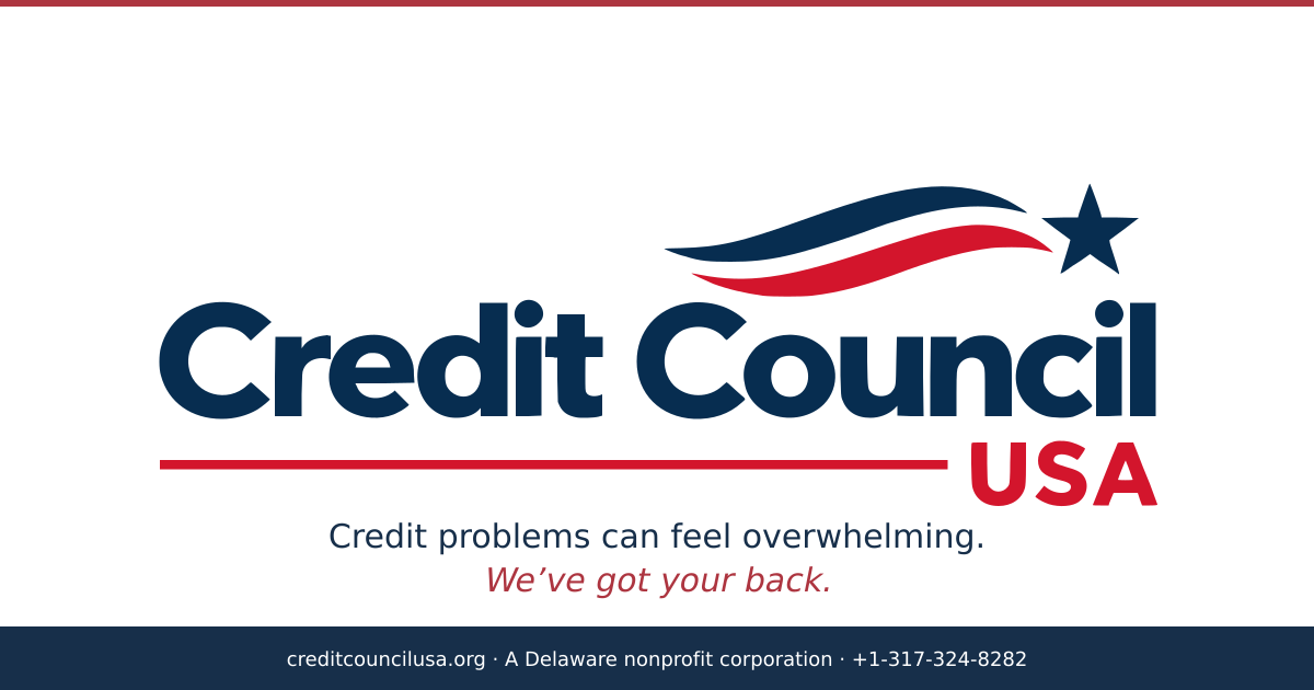
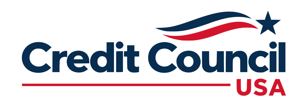
The official mark is a horizontal lockup: “Credit Council” in navy with a red rule beneath it and “USA” in red at the lower right; above and to the right, two flowing flag waves (navy over red) with a navy five-pointed star. Never rebuild the lockup from separate type and artwork — use the masters below.

The mark is drawn in its own ink pair: navy #072d50 and red #d3152c. The interface uses a different pair (#172f4a / #ad3540) — see Colour below. Never substitute one pair for the other, and never recolour the mark outside its navy/red/white trio: no gradients, bevels, shadows, or outlines.
- Clear space on all sides: the height of the “C” in the wordmark, minimum 0.25× the lockup height.
- Minimum width: 120px on screen or 25mm in print for the lockup; 24px or 6mm for the emblem.
- Do not stretch, rotate, skew, or outline the mark; do not place red on red or navy on navy; do not set the wordmark in a live font.
- Titles and lockups: every page title ends | Credit Council USA.
Colourfor the interface.
These tokens are the site’s custom properties; use the names, not just the hex values — that is what keeps book and stylesheet from drifting apart.
- Navy is the ink; red is the signal. Never set red as a background for body text.
- Red is the only accent — no teals, greens, golds, or gradients anywhere.
- The mark’s own ink pair (navy
#072d50, red#d3152c) is for the mark only.
Typography.
| Role | Family | Notes |
|---|---|---|
| Display & headlines | DM Serif Text | 400 regular, tracking −0.025em; the italic cut carries the red emphasis phrase. Never bold — weight comes from size. |
| Body, UI, forms, legal | Arial / Helvetica | 400 body; 600–700 for labels, nav, buttons. Nothing functional is set in the serif. |
- Hero display h1
clamp(48px, 4.75vw, 72px); page h1clamp(40px, 4.6vw, 64px); h2clamp(32px, 3.5vw, 46px); body 16px / 1.75. - Both faces are served self-hosted by creditcouncilusa.org — do not load third-party font files.
Voiceand vocabulary.
| Line | Role |
|---|---|
| “Credit problems can feel overwhelming.” | States the problem in the reader’s own words. |
| “We’ve got your back.” | The promise — the one place red carries meaning in display type. |
| “Find your next step.” | The imperative we want a reader to act on. |
| “Get Expert Help” | The header CTA and conversion path. |
- No predatory vocabulary: never “fix your credit in 30 days”, “secret loopholes”, or “erase bad debt”. Use “personalized debt assessment”, “structured counseling”, “consumer advocacy & education”.
- Entity names: full legal name Credit Council, USA Inc. for filings and banking; Credit Council USA everywhere else; the acronym CCUSA is internal only, never consumer-facing.
- Product vocabulary: the help hub is Get Help; the blog is The Journal; the primary CTA is Find your next step.
Assetsready to download.
All masters are byte-identical to the ones this site serves. SVG first; PNG exports for mockups and documents.





Questions?Ask once.
Brand and asset questions: contact@creditcouncilusa.org. General contact facts: +1-317-324-8282 · 221 W 9th St PMB 1058, Wilmington, DE 19801.